PYRAMID TECHNOLOGIES, INC.
Pyramid Technologies, Inc. is a leading provider of secure payment solutions, specializing in the design, development, and support of bill acceptors, printers, and payment software. Based in Mesa, Arizona, they serve businesses worldwide by creating innovative and reliable products that streamline payment processes, all meticulously crafted and tested in-house to ensure quality and security.
Brand Refresh
One of the first steps I took in updating the visual identity of Pyramid was to update the company’s color and typography. We played around with the idea of doing a logo update as well, but due to the complications that may arise I ultimately made the decision that an updated color palette and typography guidelines would be sufficient to establishing a modern and refreshed brand.
Old Color Palette
New Color Palette
Color and Typography Guidelines
A deep, rich blue paired with a simple white background helps to evoke a sense of security and simplicity. The blue signifies trust and reliability, essential for a company in automated payment systems, while the white background enhances clarity and ease of use.
This fresh color palette, combined with the modern Montserrat typeface, gives the brand a professional and refined look. Montserrat’s clean, easy-to-read style emphasizes Pyramid’s commitment to precision and innovation, making the brand more approachable. Overall, the refresh strengthens Pyramid’s position as a trustworthy and forward-thinking leader in its industry.
Logo Usage and Variations
A set of defined rules were established to help guide the use of Pyramid’s logo in the process of design. This included the use of color with the logo, as well as the available variations of the logo itself.
Full Logo
Logotype
Icon/Symbol
Color Variations
Website Update
Pyramid Technologies needed a website update to better serve as a marketing tool and resource hub for customers. The focus of the redesign was to highlight Pyramid's products by showcasing their features and key benefits. Since the website primarily provides product information, contact forms, and access to manuals and firmware updates, I chose Squarespace for its simplicity and ease of use. The site was designed with a clean, structured layout, using a minimal color scheme to keep the attention on product photos and graphics, while maintaining Pyramid's established brand identity.
Print Marketing Collateral
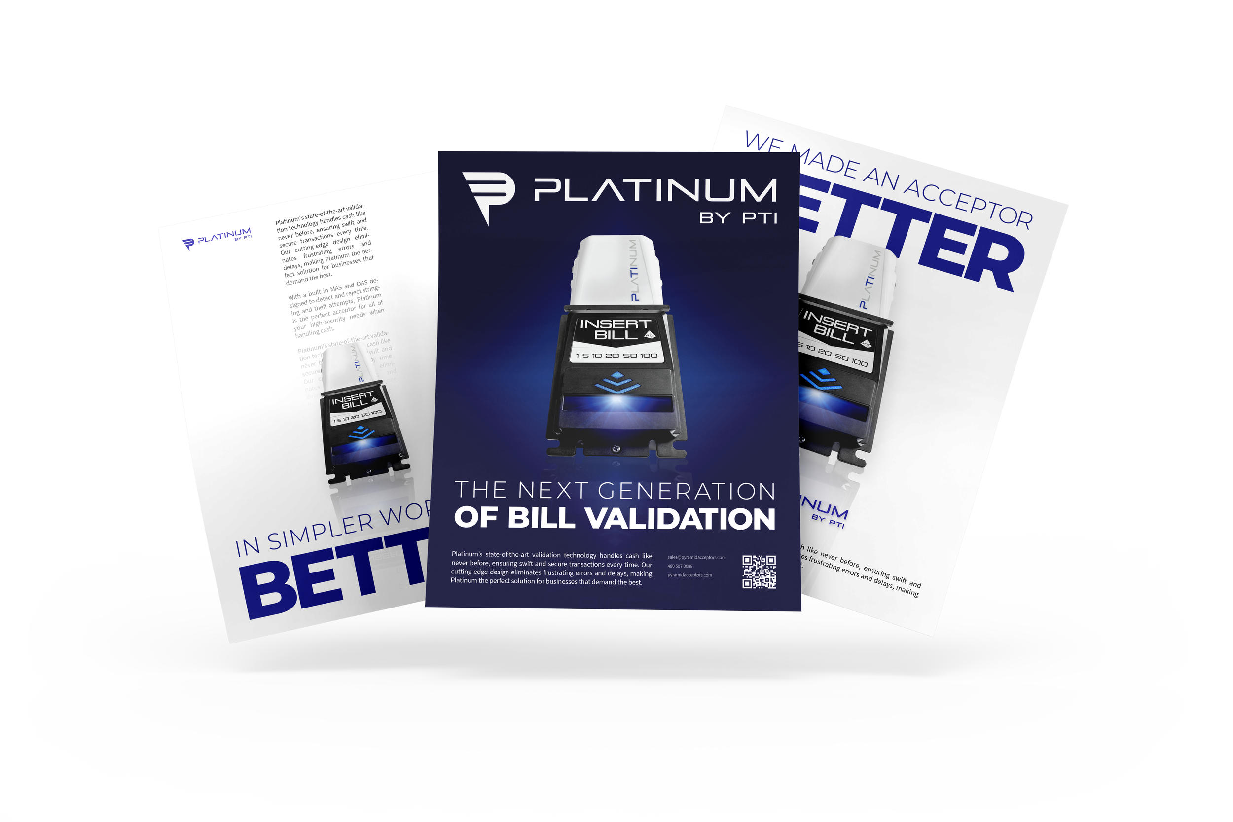
Print Advertisements
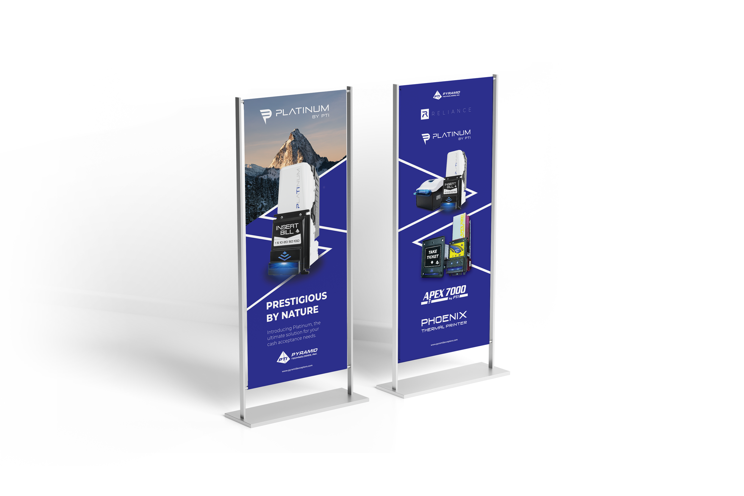
Tradeshow Displays
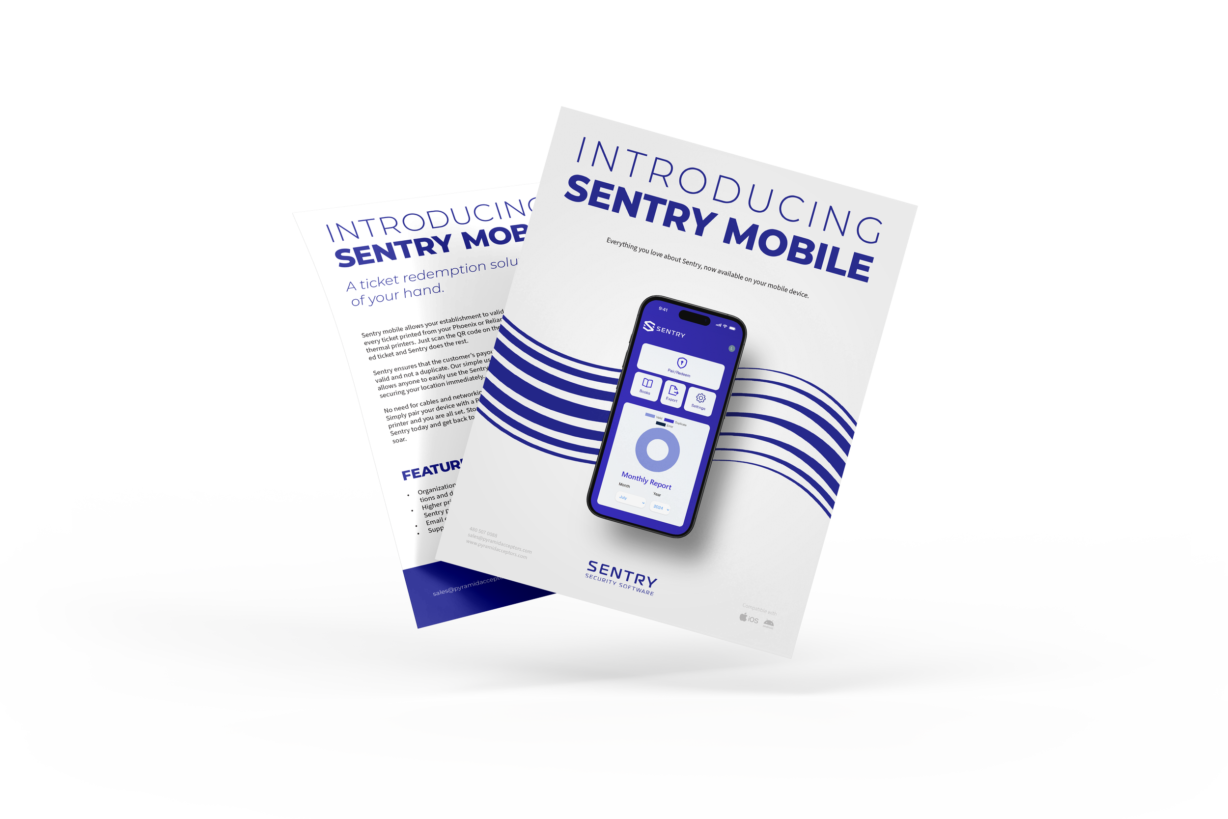
Brochure Design
Business Cards


