DIAITA (δίαιτα)
noun
way of living, way of life, mode of life, lifestyle
Project Brief
Overview
There are a wide variety of apps and websites that aim to help users improve their health and nutrition
We noticed that the majority of these apps are typically not designed for beginners to shopping, cooking, and eating healthy
DIAITA aims to create a system for the average “microwave dinner” cook to change their diet and ultimately their lifestyle
My Role
As a member of a senior capstone project I was tasked with exploring the needs of users as it relates to their nutrition. I spent a few months compiling market research and conducting user interviews. I was also a key member in the app’s UI design features, drawing on my research to help influence big picture design decisions.
Market Research
MyFitnessPal
Provided a way for users to easily track calories and nutritional content within the app. Did not however generate meals, provide recipes or create meal plans.
Eat this Much
Generated meals from dietary variables but did not create a meal plan for users. Many of the wanted features were only available with the paid version.
Mealime
Featured personalized meals based off a set of user variables and offered recipes. It also provided a nutritional tracker and grocery delivery.
We started our research by conducting user interviews to gauge the wants and needs of potential customers for our app. After talking with qualified candidates (anyone who regularly cooks for themselves and/or others), we found that users are interested in a few things when considering using a nutrition app.
Ease of use (the app should not get in the way of their day to day life)
Stress free
Informational (the users not only wanted to know what they should eat, but also why they were eating it)
After surveying a wide variety of nutrition apps we found a handful of issues that users expressed concerns with, including:
Calorie trackers
Subscription plans for meals
No grocery list for the meals they had scheduled
All of these apps provided some amount of value that was beneficial but failed in other areas that users had expressed a need for. There was yet to be one singular app that met the needs of busy cooks on the market.
User Interviews
Design Goals
Based on the user insights gathered during the research phase, the following design goals were established for the DIAITA app:
Provide a personalized and intuitive meal planning experience.
Offer a wide range of recipes that meet individual preferences and dietary restrictions.
Streamline shopping list management to enhance convenience and organization.
Provide easy to follow recipes that allow for an easier cooking experience
Wireframing
The next step in the design process was to develop a solid information architecture and create wireframes to outline the app's structure and functionality.
Onboarding
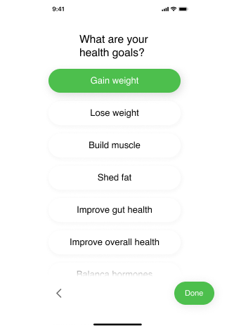
A seamless onboarding experience to set up user profiles, input dietary restrictions, goals, and preferences.
Meal Planner
A user-friendly interface to create personalized meal plans for breakfast, lunch, dinner, and snacks. Users can select recipes or have the app suggest meals based on their preferences.
Shopping List
An organized and easy-to-use shopping list feature that integrates with meal plans and recipes, allowing users to efficiently manage their grocery shopping.
Visual Design
The visual design phase focused on creating an aesthetically pleasing and intuitive user interface (UI) that aligned with the app's branding and target audience preferences.
Visual elements, such as color palettes, typography, and iconography, were carefully selected to create a visually appealing and cohesive experience. Multiple iterations and feedback loops were conducted with users to refine the UI design and ensure usability.
Due to the time constraints of the project, our wireframes also became our first prototypes for the visual UI. We would then go on to use these prototypes to test users for usability.
Final User Testing
During the final user testing phase, the DIAITA app prototype was evaluated by a diverse group of participants representing the target audience. The testing sessions focused on assessing the usability, functionality, and overall user experience of the app.
Valuable insights were gained from the user testing, including positive feedback regarding the app's intuitive interface, personalized meal planning capabilities, and diverse recipe library. Participants particularly appreciated the seamless integration between meal plans, shopping lists, and reminders, which streamlined their meal preparation and grocery shopping activities.
Some insights for improvement included the need for clearer visual cues for dietary restrictions and more customization options for meal plans.
Next Steps
Ideally, if this app were to be fully developed, we would like to see the recipe section come alive by allowing users to share recipes through the app.
It would also be beneficial to create a section that outlines how to select the correct dieting structure, what that diet will do for you, and why.
We were told by many users that it would be nice to have an option in the shopping list where prices and locations of certain foods are easily seen. This is something we considered when designing the app, however, to make things as simple and straightforward as possible we decided to not include these functions.


